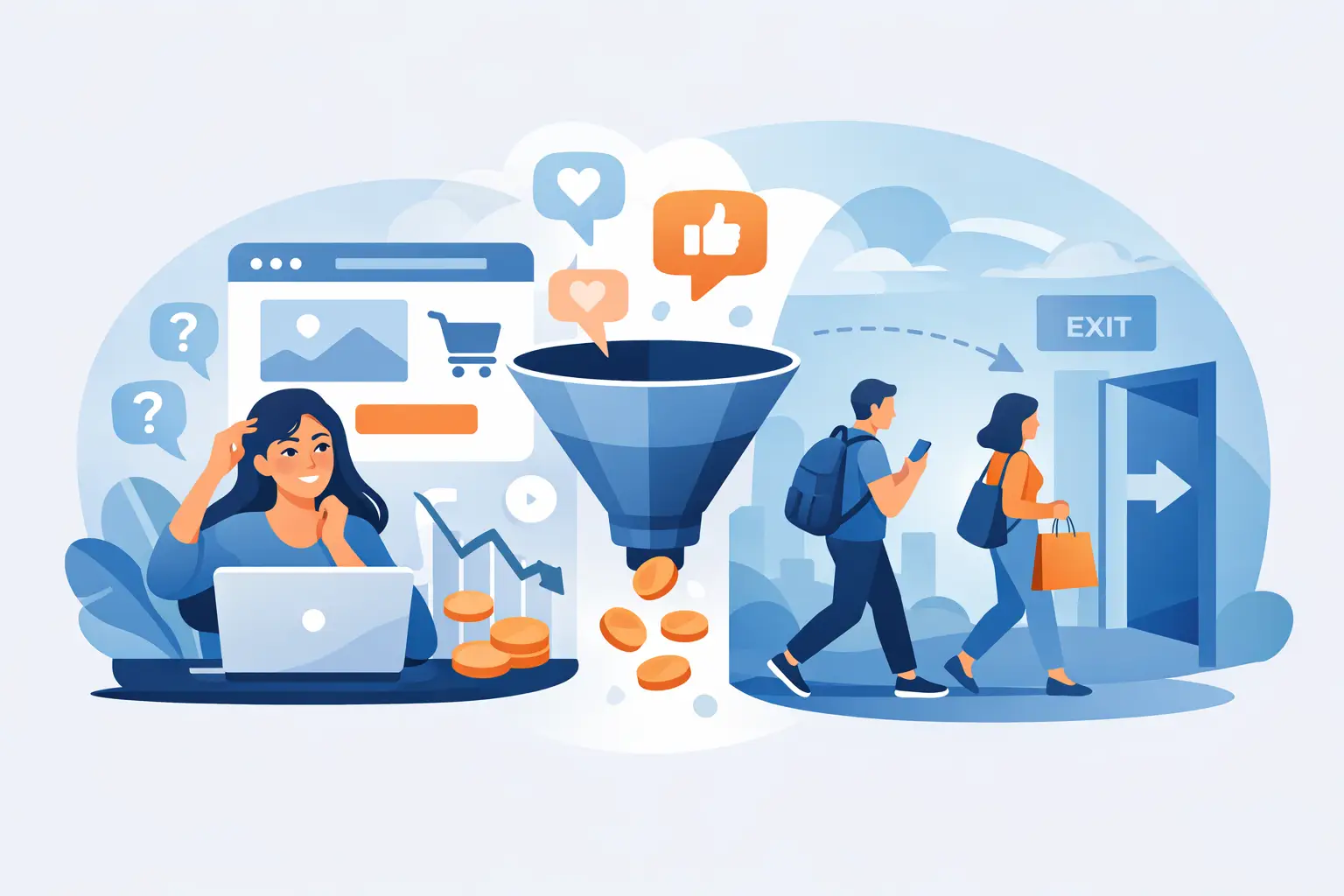
If your website is getting traffic but not turning that attention into calls, form submissions, bookings, or sales, the problem usually is not “more traffic.” It is what happens after people arrive. When business owners ask why are website visitors not converting, they are often looking at a marketing problem that is actually part messaging issue, part trust issue, and part systems issue.
That matters because more traffic will not fix a weak path to action. In many cases, sending more people to the same underperforming site just means paying more to confirm that something on the site is not doing its job.
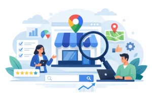
Why are website visitors not converting even when traffic looks good?
A lot of small business websites are built to explain the business, not to guide a decision. There is a difference. A visitor does not land on your site hoping to admire your menu, your service list, or your homepage layout. They are trying to answer a much more practical question: can this business help me, and do I trust them enough to take the next step?
If your site does not answer that quickly, people hesitate. They click around, get distracted, or leave. That does not always mean the website is bad. It often means the website is unclear.
Clarity beats cleverness here. A polished design can help, but design alone will not carry conversions. If the value proposition is vague, if the next step feels uncertain, or if the site creates extra effort, visitors will move on.
The biggest reasons website visitors do not convert
Your message is too general
Many small business sites try to appeal to everyone. The result is copy that sounds safe but says very little. Phrases like “quality service,” “trusted team,” or “solutions for your needs” are common because they feel professional. They also blend in with every competitor.
Visitors need specifics. What do you do, who do you do it for, and what result should they expect? If someone lands on your homepage and cannot answer those questions in a few seconds, your messaging is creating friction.
This is especially true for local service businesses. If you serve a clear area, solve a clear problem, or specialize in a certain client type, say it plainly. Specific language helps the right person feel seen.
The site does not build trust fast enough
Trust is one of the most overlooked conversion factors. Small business owners sometimes assume trust is earned later, after a phone call or estimate request. Online, it starts immediately.
If the site feels outdated, thin, inconsistent, or hard to verify, people get cautious. That does not mean you need a flashy website. It means people need enough proof to believe you are credible, active, and professional.
Strong trust signals can include real testimonials, recent photos, clear contact information, a visible service area, straightforward explanations of your process, and copy that sounds like a real business instead of an ad generator. If your site promises a lot but proves very little, visitors may be interested without feeling ready.
Your calls to action are weak or confusing
A conversion is a decision moment. Your website should make that next step obvious.
Too many sites either hide the call to action or overload the visitor with options. If the page asks people to call, email, fill out a long form, join a newsletter, follow on social media, and request a quote all at once, the result is often no action at all.
The best next step depends on the business. For one company, it may be a phone call. For another, it may be a short estimate form. For a higher-trust or higher-ticket service, it may be a consultation request. What matters is that the action fits the buyer’s readiness and is repeated clearly throughout the site.
You are attracting the wrong traffic
Sometimes the website is not the core issue. The traffic is.
If your SEO, ads, or social content are bringing in people who are curious but not qualified, conversions will stay low. A page can perform poorly because it is attracting bargain shoppers, out-of-area searchers, job seekers, or people looking for something adjacent to what you actually offer.
This is where data matters. High traffic is not the same as good traffic. A smaller number of aligned visitors will usually outperform a larger number of mismatched ones.
The website creates too much work
People do not convert when the path feels inconvenient. Long forms, slow pages, too many clicks, mobile issues, and hard-to-find information all chip away at momentum.
Most visitors are not sitting at a desk with unlimited patience. They are checking your site between tasks, during work breaks, or from their phone. If they have to hunt for pricing clues, service details, or basic contact information, many will stop trying.
This is one reason conversion problems are often operational, not just creative. A website needs to support how people actually make decisions, not how the business wishes they would.
What your website may be signaling without you realizing it
A website communicates more than the words on the page. It also signals confidence, clarity, relevance, and competence.
For example, if your homepage spends most of its space talking about your business history but very little on customer outcomes, visitors may read that as self-focused. If your contact form asks for ten fields before someone can ask a simple question, it may signal unnecessary effort. If your brand voice changes from page to page, it may feel less trustworthy, even if the visitor cannot explain why.
None of this means your site has to be perfect. It means small signals add up. People are making quick judgments based on whether your business feels current, clear, and easy to work with.
Why are website visitors not converting on mobile?
Mobile performance deserves special attention because many local businesses now get the majority of their website traffic from phones. A page that feels acceptable on desktop can be frustrating on mobile.
Buttons may be hard to tap. Text may feel dense. Forms may be annoying to complete. Important trust elements may get pushed too far down the page. Phone numbers may not be clickable. When that happens, the site loses people who may have been ready to contact you.
If you have not reviewed your site from a real customer’s point of view on a phone recently, start there. It is one of the fastest ways to spot preventable friction.
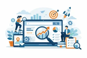
How to diagnose the real problem
The answer is rarely one thing. Most conversion issues come from a combination of weak messaging, missing trust, and poor user flow.
Start by looking at your top pages, not the whole website at once. Which pages get the most traffic? Which pages are meant to drive action? If the homepage gets attention but the service pages do not support the next step, the homepage is not the only issue.
Then compare behavior against intent. Are people leaving quickly from pages that should reassure them? Are they visiting contact pages but not submitting forms? Are they spending time on your site but skipping the action you want? Those patterns usually point to a gap in either clarity or confidence.
This is also where outside perspective helps. Business owners are often too close to their own site. You know your business so well that it is easy to miss where a first-time visitor feels confused.
What to fix first if visitors are not converting
Start with your homepage headline and your main service pages. Make sure they clearly explain what you do, who it is for, and what the next step should be. Then tighten the call to action so it is easy to understand and easy to complete.
After that, strengthen trust. Add proof that feels real, not generic. Use testimonials that mention outcomes. Show photos that reflect your actual business. Make your service area, process, and contact options easy to find.
Then look at friction. Shorten forms where possible. Improve mobile usability. Remove clutter that competes with the main action. If every page is trying to do five jobs, conversions usually suffer.
There is a trade-off here. A site can be too minimal just as easily as it can be overloaded. Some visitors need more detail before they act, especially for higher-cost or higher-trust services. The goal is not to strip everything down. The goal is to make the path feel clear.
At Brown Business Group, this is often where strategy matters more than tactics. You do not need more random website edits. You need to know which changes are most likely to improve decisions, not just appearance.
A website should not leave your best prospects uncertain. If people are finding you but not moving forward, that is not a reason to panic. It is a reason to get more honest about what your site is asking visitors to believe, understand, and do next.